One of the key requirements for operating a membership website and making it profitable is to reduce the churn rate.
There are various know-how and techniques for the process of getting members to join, and many operators are following this advice and making efforts day by day to increase the number of members one by one.
However, it’s surprisingly common for members to quit once they have joined.
Such cancellations occur for reasons other than lack of interesting contents.
According to user surveys, a large percentage of the reasons are
“Boredom,and feeling stuck in a rut“…
This time, we will focus on the overall membership website.
In this article, we will discuss one technique that can help you create an atmosphere of “never getting bored” throughout your membership website!
You can’t keep changing the content…so what do you do?
The nature of a Membership Website is that people gather around a main theme, and then the content is updated with text and videos.
In other words, once content is created, it’s often stored in chronological order, and the content itself cannot be renewed as frequently as a non-participatory, browse-only website.
Also, the interface is the same as the flow line in a room, and is created by thinking through the most user-friendly and good environment. It’s not something that can be changed constantly in order to keep people from getting bored.
Even under these conditions, which are more difficult to innovate than non-participatory websites, you can add a “twist” to your membership website to keep users from getting bored.
One of The ways we recommend is to-
“try to incorporate a beautiful design in line with the nature”.
What’s next? curiosity stimulates the brain.
To revamp the site image under such limited conditions is to “change the image/visuals”.
However, as mentioned above, visitors “use” the content, and in order to have them continue to use the site smoothly through sensory operations, it’s important to change the site image in a way that never makes them feel like they can look at it and say “What?! Where did that icon I always used go? Ahh.. here it is! Why are they changing the look of this site? feel so bad!” We cannot afford to give people this bad impression.
Therefore, we need to be careful about the way we change the appearance from time to time in order to avoid boredom.
Even with these conditions, there is ”a trick” to change the visuals frequently and in a way that is satisfactory to the user.
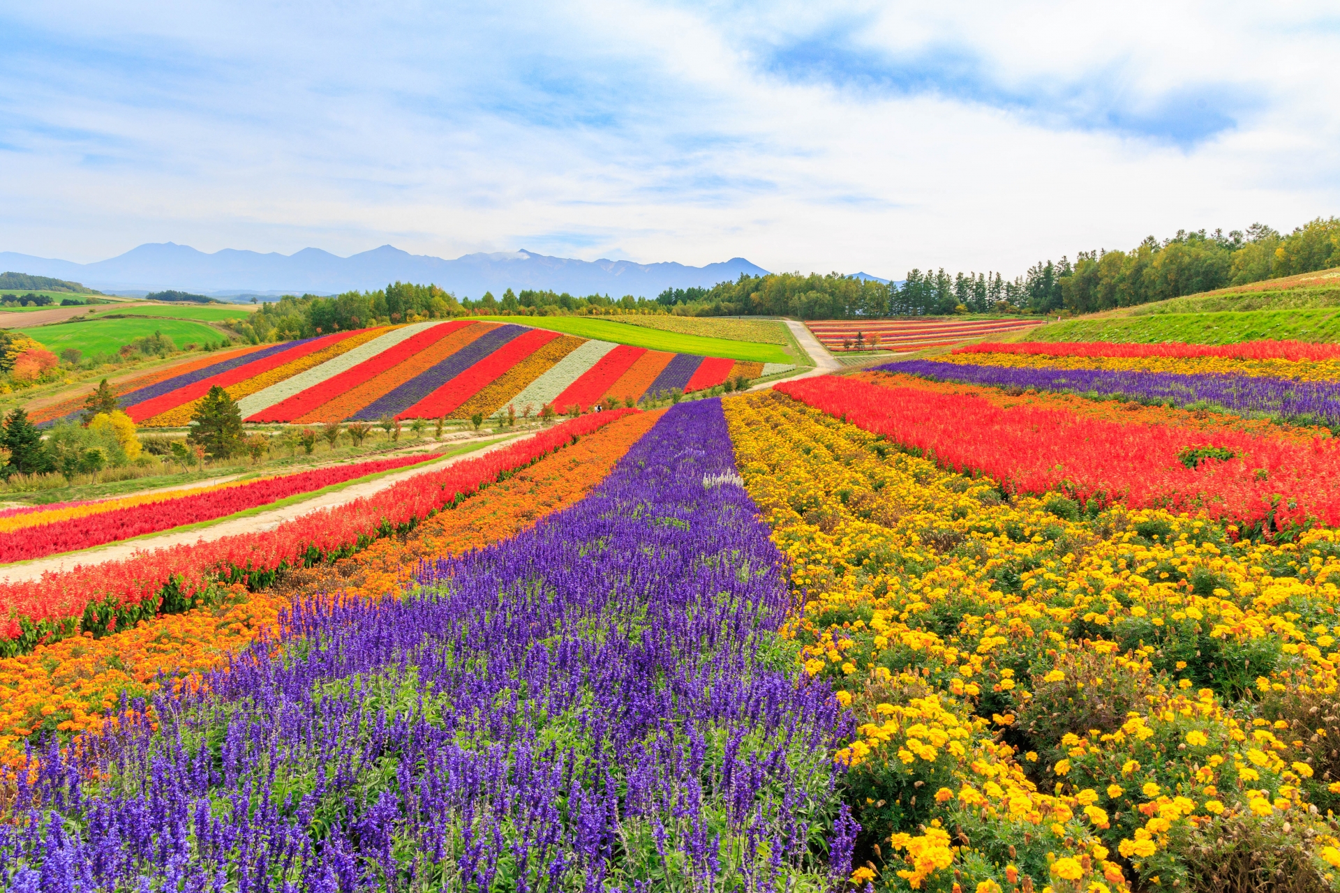
That is,to subtly incorporate visual images that are in line with The season.
Without changing the design of the icons used daily or the entrance markers of the content, change the top image, the organizer’s photo, the Membership Website’s image character, the company emblem, or other prominent parts of the site slightly for each seasonal event.
In winter, a snowy landscape. In summer, swimsuits and ocean scenes. Autumn is autumn leaves, wheat harvest, etc.
Since the seasons in nature have beautiful visual icons that everyone can relate to, why not take advantage of them?
By adding a little bit of this kind of casual, ever-changing, playful atmosphere to your online salon, you are guaranteed to create an atmosphere that will never bore you. Please give it a try!